MIAMI UNIVERSITY COURSEWORK 2025
SELF-DIRECTED PROJECT
The Self-Directed project is a project in which students can create and develop a design project of their choosing. They are to create and follow their own deadlines.
For my Self-Directed Project, I chose to design three different posters, each poster aiming to achieve a different objective.
PROCESS
IDEATION and inspiration
When beginning this project, the hardest part was deciding what project I wanted to take on. I met with my instructor, and she assisted in narrowing down my ideas, landing on the idea of creating three posters.
I decided I wanted each poster to achieve a different goal, in order to give myself somewhat of a challenge. I decided I wanted one poster to be music-themed, another poster to be marketing something, and the third poster to be something fun I would want to hang in my own room.
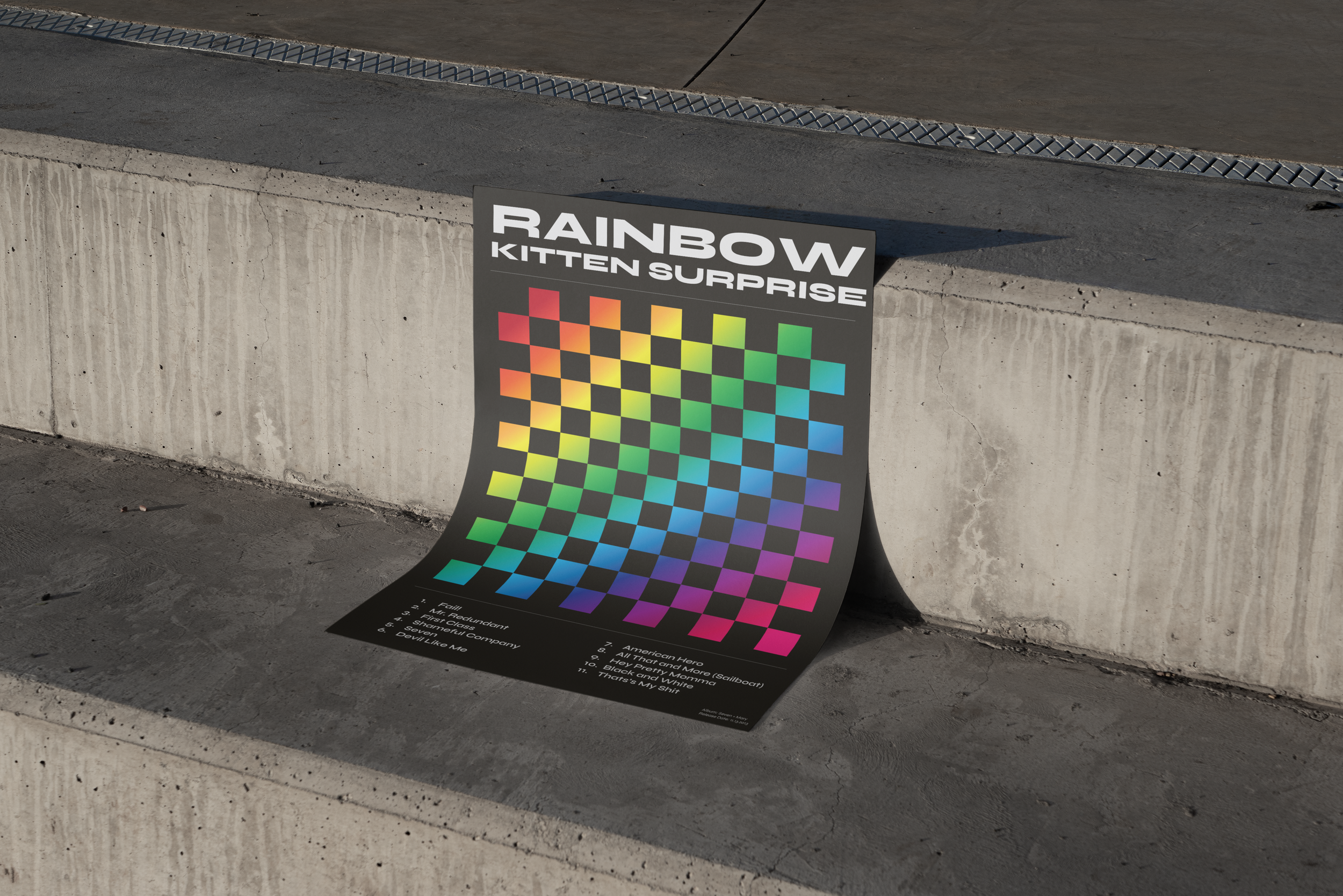
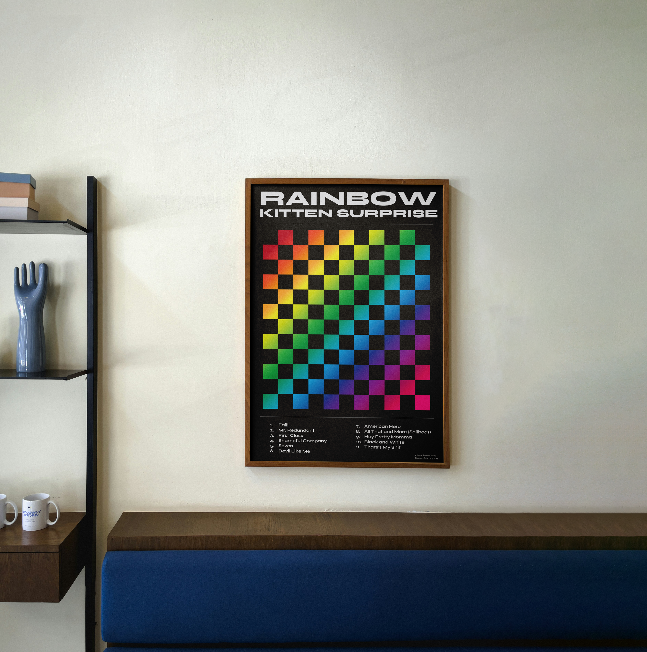
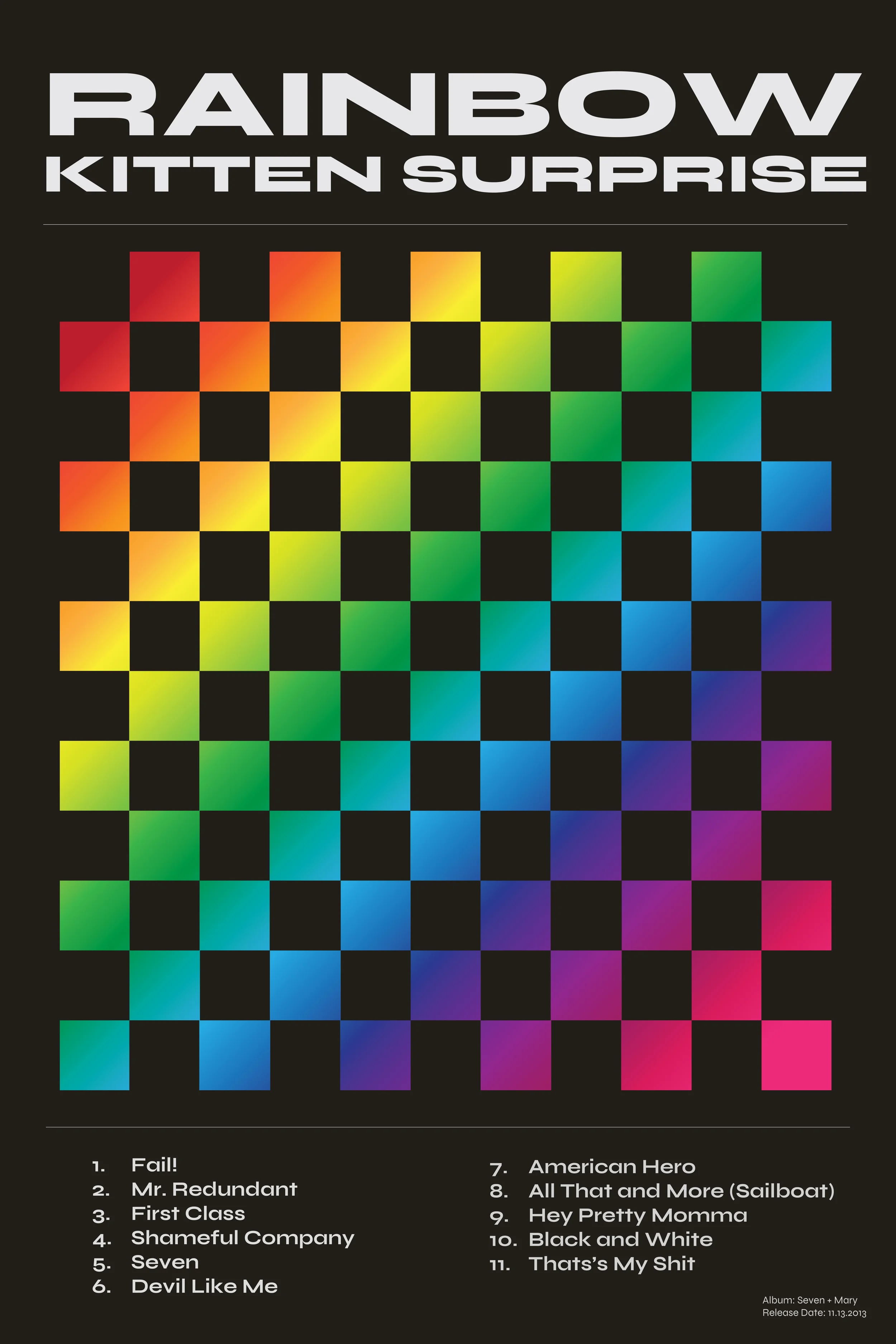
For the first poster, the music-theme, I chose to focus on one of my favorite bands, Rainbow Kitten Surprise. I found inspiration for music posters I thought were successful.
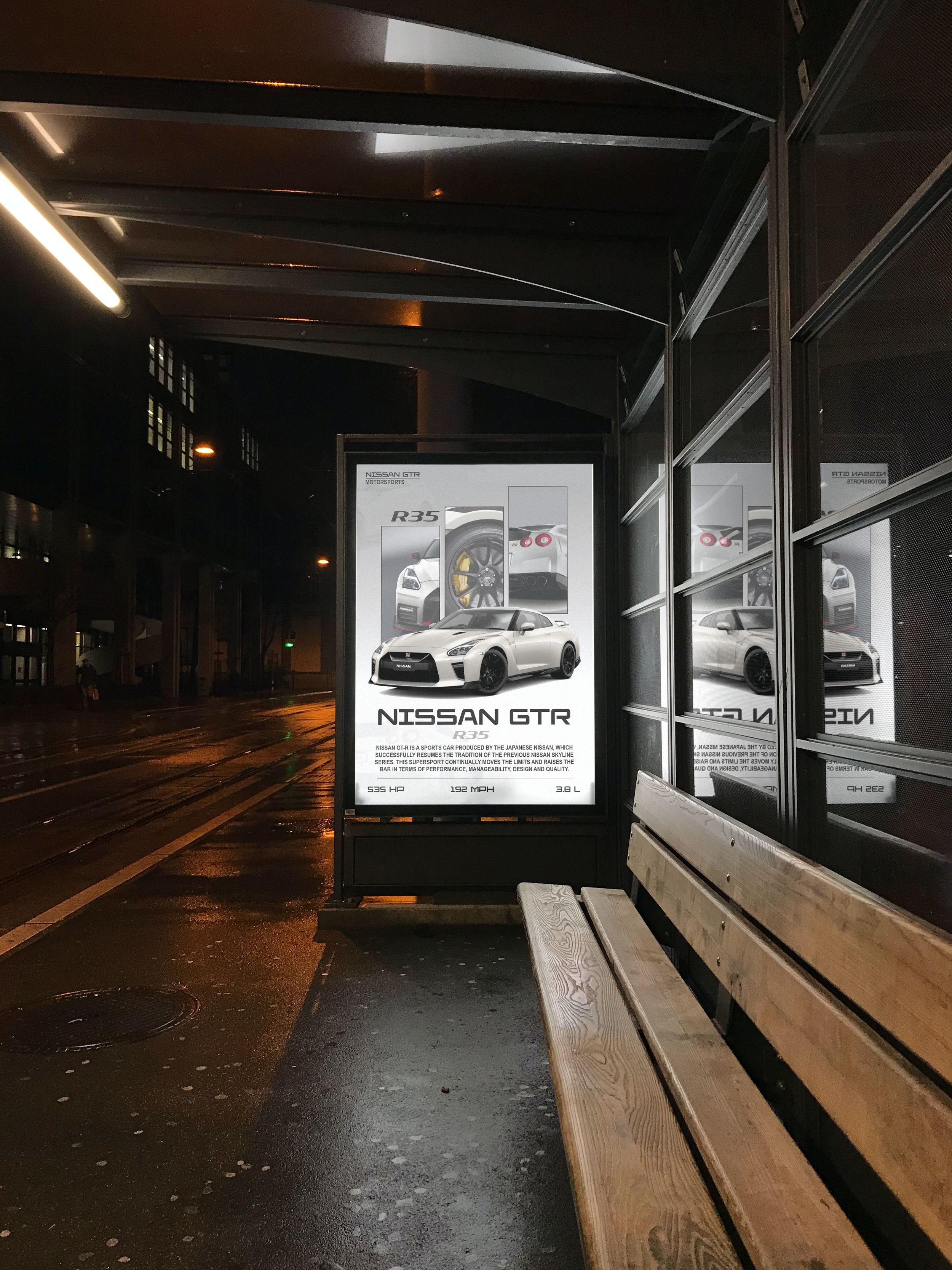
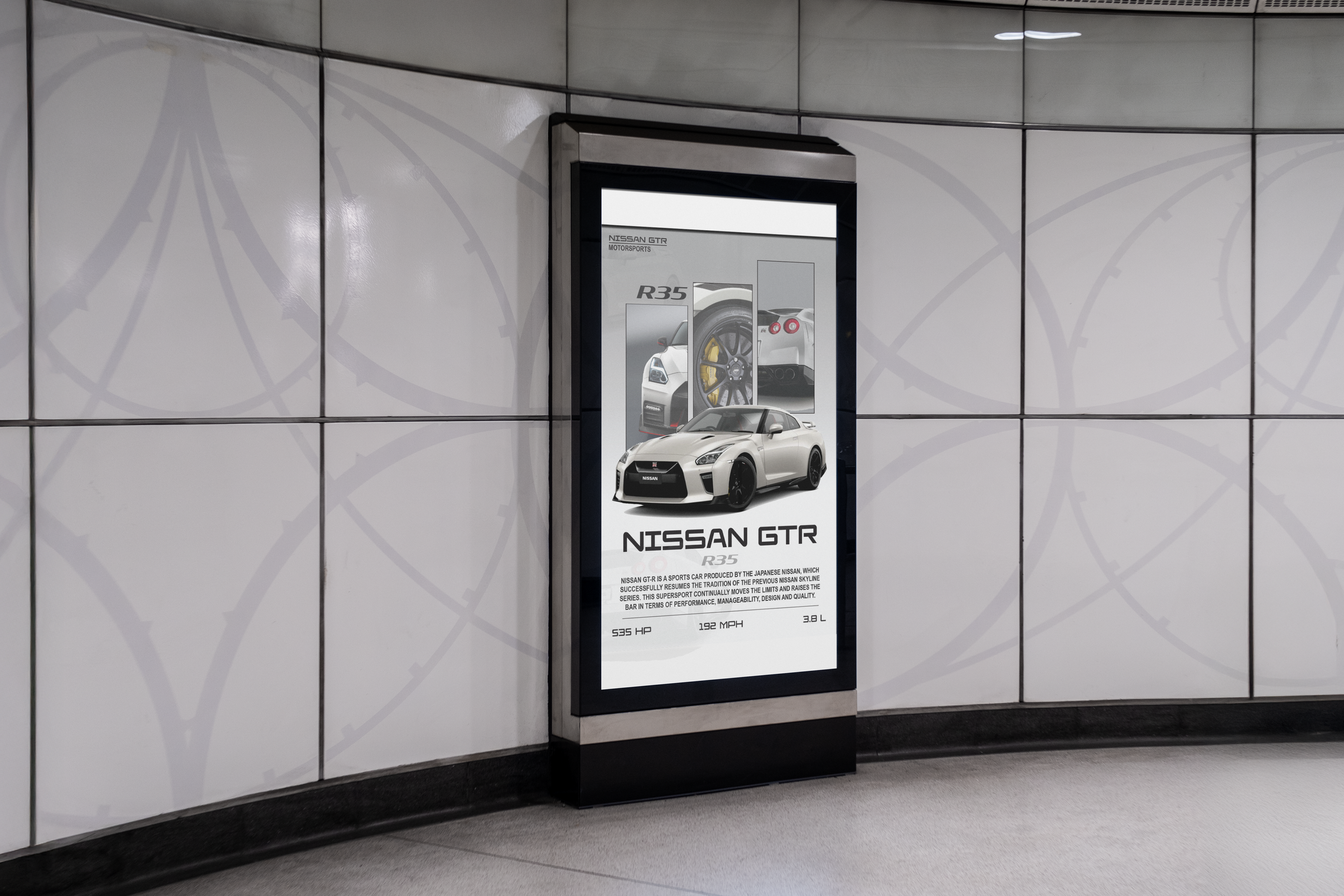
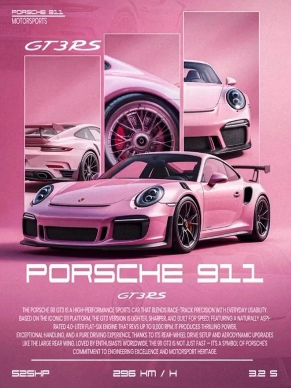
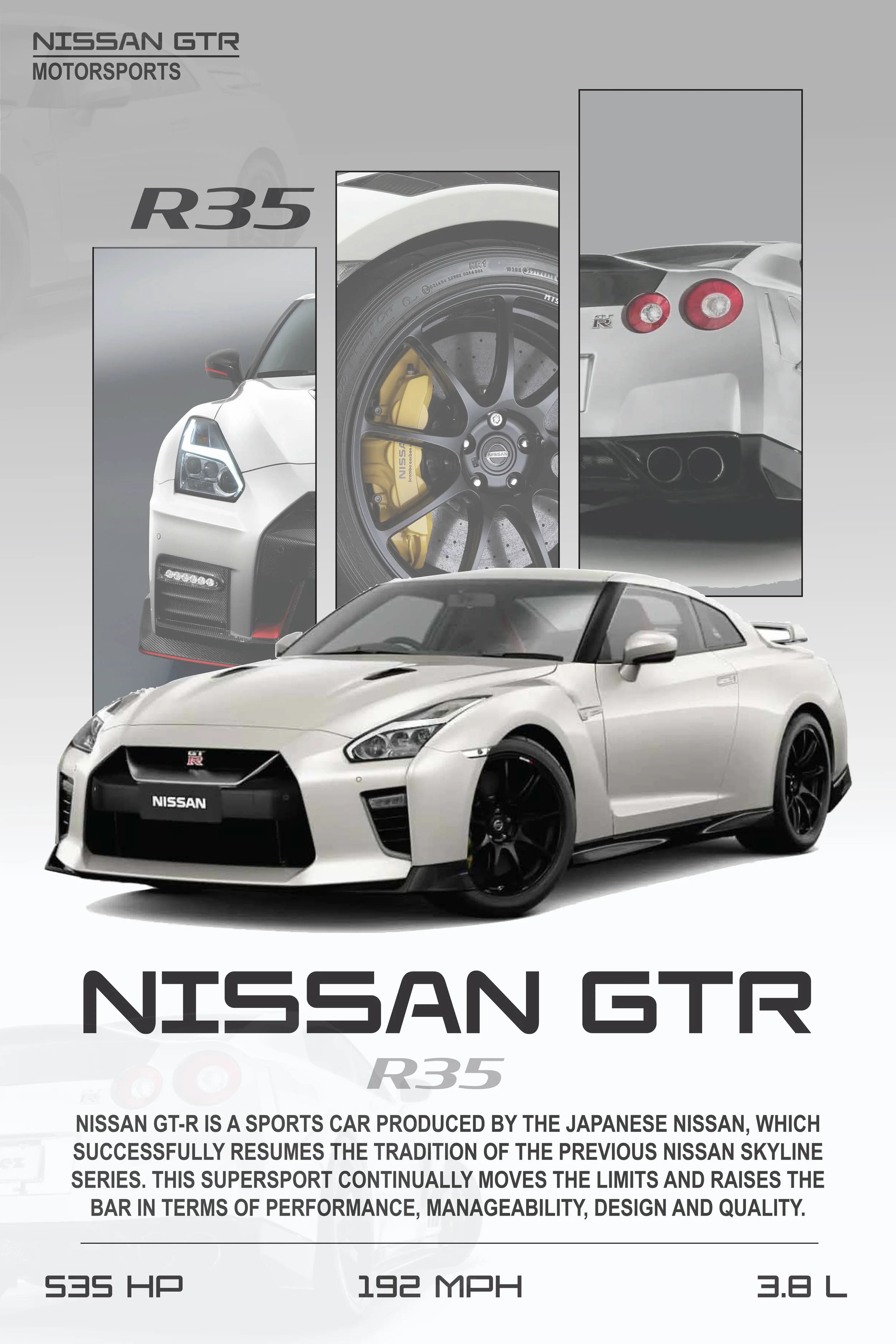
For the second poster, I took inspiration from Day 54 of a 100 Days 100 Poster Design Challenge video I had previously saved on Instagram (@abgraphicsstudio). The creator created a similar layout of a Porsche 911. As someone who has always had a love for vehicles and the design and technology surrounding them, I decided to create a poster marketing my favorite car, a Nissan GTR R35.
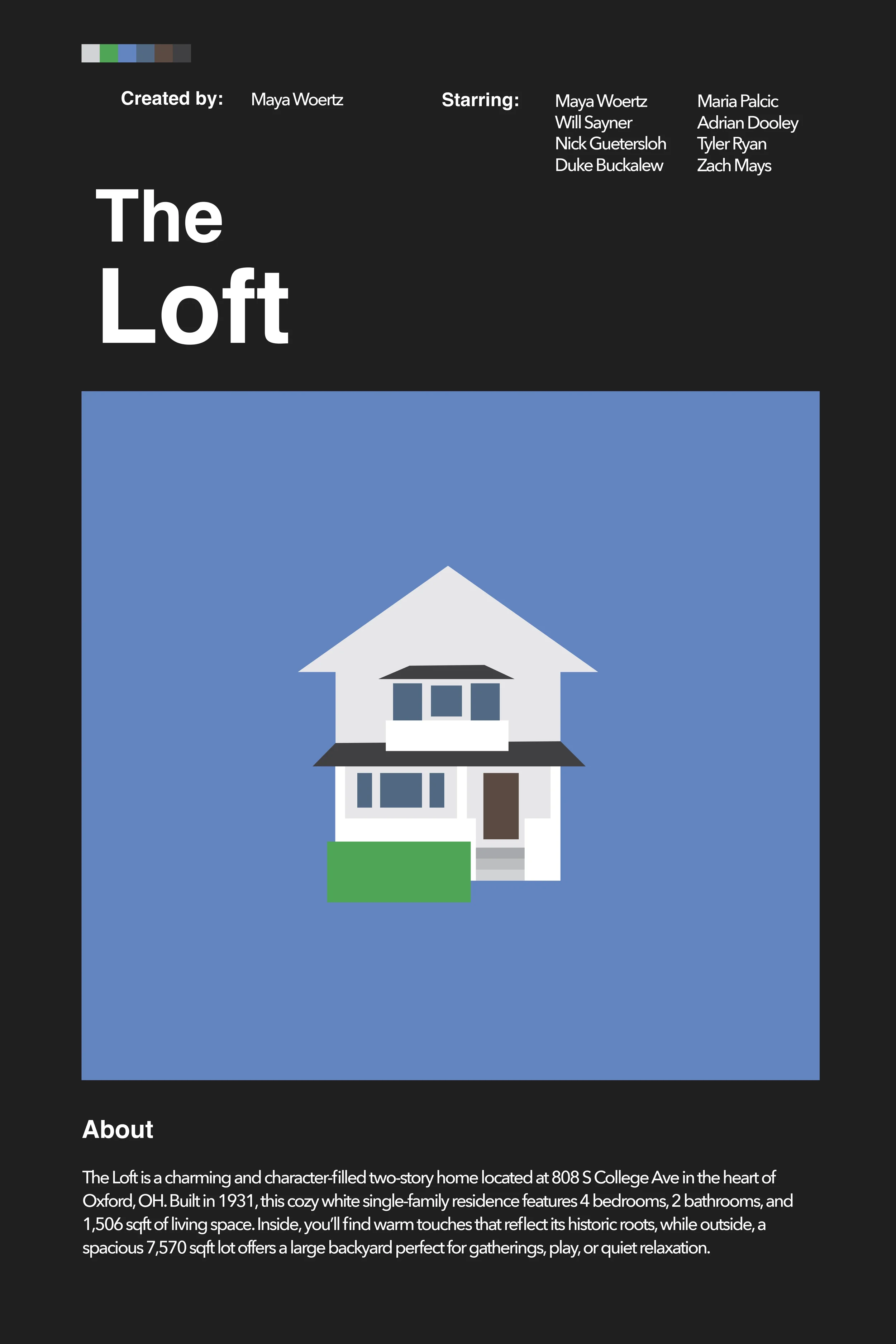
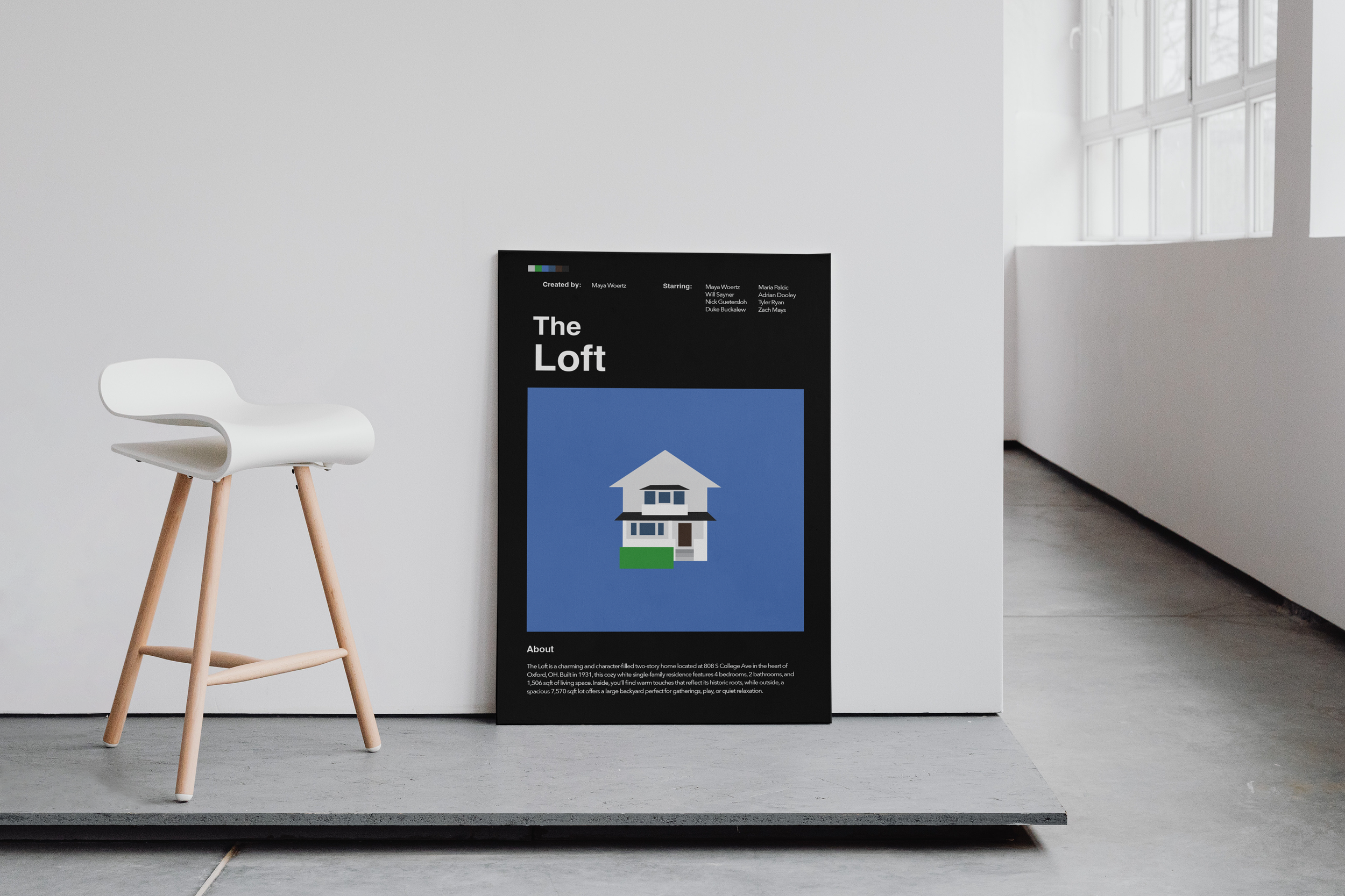
For the last poster, I struggled with choosing one concept. I bounced around ideas from Pinterest for a while, before deciding to go my own direction. I wanted to design a poster for my college house.
Most influential images from inspiration board and @abgraphicsstudio on Instagram
POSTER ONE - DESIGN DECISIONS
Because this project was self-directed, there were no iterations/versions of my posters. I worked on each poster, and if I didn’t like something I changed it and continued forward. However, there of course were intentional design decisions behind each.
TYPOGRAPHY
For the Rainbow Kitten Surprise poster, I used one of my favorite fonts, Syne. It is a bold elongated typeface. I chose this font because similar to the typeface, this band is bold in sound and personality. While their music is considered ‘alternative rock’, it has a more modern twist on it. Therefore, I thought a clean, sans-serif typeface would likely work best.
COLOR
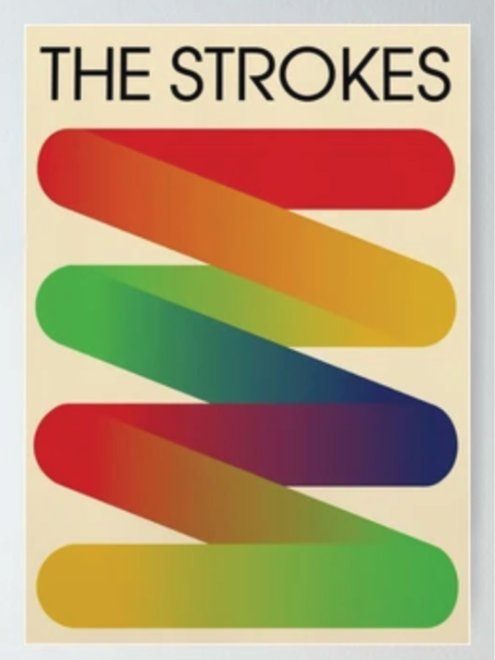
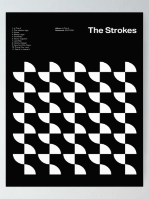
I chose a rainbow gradient to represent the name of the band. Inspired by the Strokes poster (included above), I chose to do a repeating pattern of black squares over a rainbow gradient. Originally, I had a repeating pattern of squares, each row a different color. However, I felt as though the actually gradient acting as negative space was more successful than the squares imitating a gradient as they moved down.
Image from process
POSTER TWO - DESIGN DECISIONS
TYPOGRAPHY
For the Nissan poster. I used a geometric, sans-serif typeface, Elevon. I chose this font because short, wide fonts, such as this one can often be seen in the world of cars. The inspiration I followed, utilized a similar text, though not the same. I felt as though my font had more balance and slightly more curvature than that of the inspiration. For the body text I chose a condensed, tall font, Arial Narrow. It contrasted the wide header text nicely and pulled the whole poster together.
COLOR
Color is where I chose to go a different route from the inspiration. I have always been more drawn to neutral colors in my design. I chose to focus on a white car with black accents, such as the wheels. Because I chose a white car, I wanted the background and font color to match. Therefore, each body of text is a variation of gray or black. Accent colors, like yellow and red, come from the images themselves.
Image from process
POSTER THREE - DESIGN DECISIONS
TYPOGRAPHY
For the final poster, my ‘freestyle’ poster, I decided to create a tribute to my college house. I drew inspiration from modern posters on Pinterest. I used a clean, san-serif font, Helvetica, for the headers and sub-headers, as well as Avenir Next for the body text.
The text at the top and bottom of the poster is meant to frame the content and image in the center of the poster. It also creates balance, having a text attribute in each corner.
COLOR
For this poster, I decided to use a black base for the background. This way, the black acts as a frame around the abstract image of our house in the center. I made this image of our house using shapes in Illustrator. The color of the shapes is based off of the realistic tones of our house. I chose a blue background, not only to represent the sky, but also because my roommates felt as though if our house’s vibe had a color, it would be blue.
Image from process