MIAMI UNIVERSITY COURSEWORK
DISTALMOTION
Through Miami University’s ‘Highwire’ class, I had the exciting opportunity to develop design assets, as well as marketing research and planning for Distalmotion, a Swedish company empowering access to robotic surgery. Four mixed teams of Marketing and Communication Design majors competed against each other to professionally pitch their marketing plan and design assets to the company.
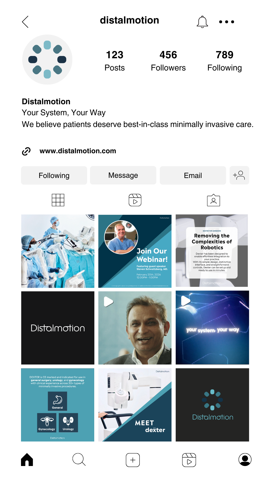
Our design team and I developed logo variations, wordmarks, email design, and several mockups including instagram posts, brochures, magazine advertisements and more.


Process
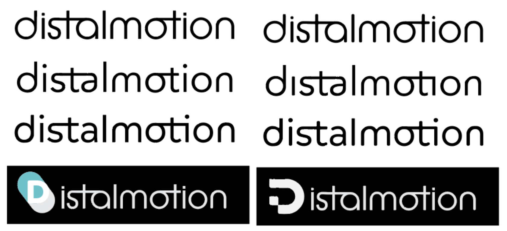
Wordmark
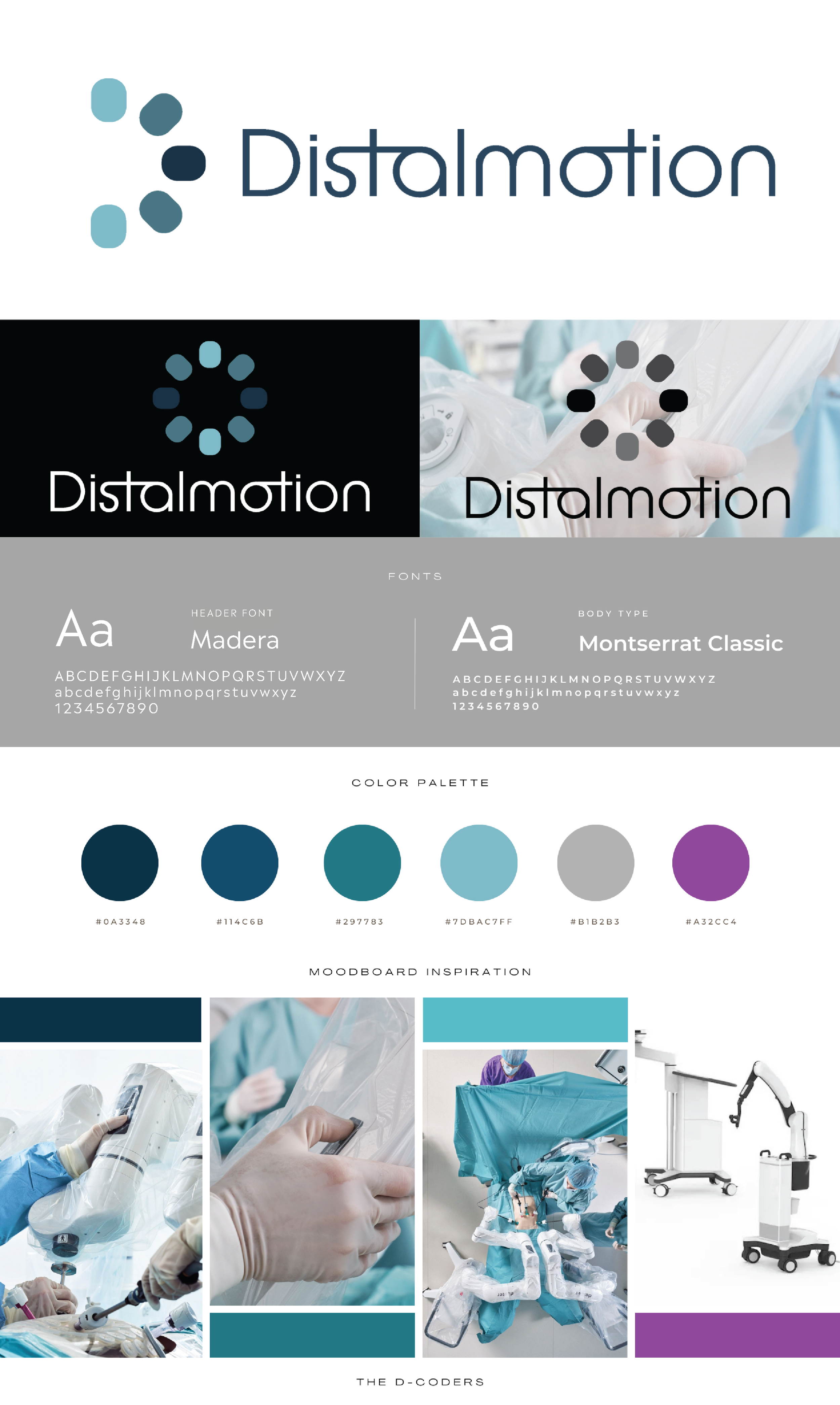
When beginning the design process, I created a wordmark, or logotype, for Distalmotion. The logotype featured the word ‘Distalmotion’ with a minimal, sans-serif font. I connected the anchor points of the letters in order to make the text appear connected. This choice was inspired by the ‘motion’ aspect of their brand and the idea of moving forward into the future of robotics.
Images of different colored final logo marks and some early process photos


LOGO
The members of the design team, including myself, developed many logo variations throughout the design process. For the primary logo, we finally landed on a minimal, repeating design that utilizes Distalmotion’s current color palette. We wanted to create design assets that would not only easily integrate in Distalmotion’s current brand design, but also elevate it. The secondary logo appears as half of the primary logo. However, it follows the outline of the ‘D’ in the logotype, in order to create balance and cohesion.
Images of final primary and secondary logos


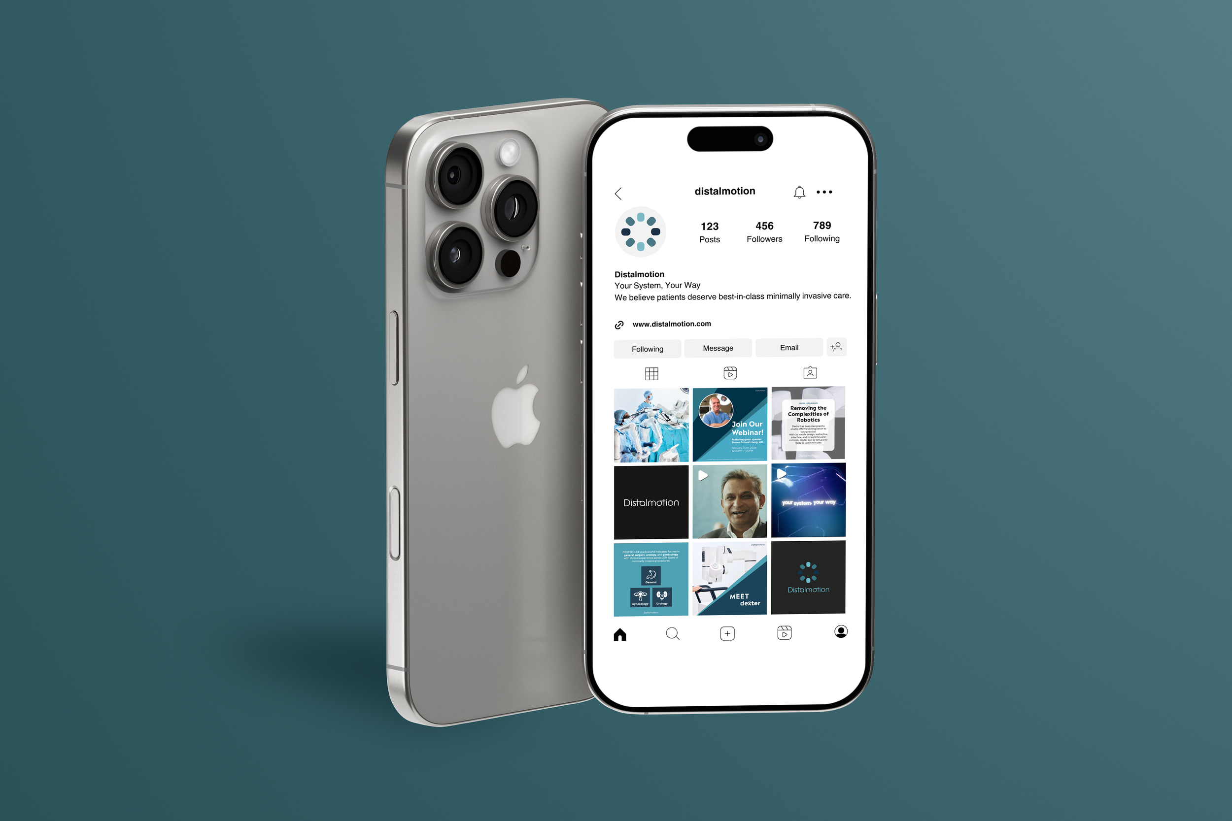
email & Magazine
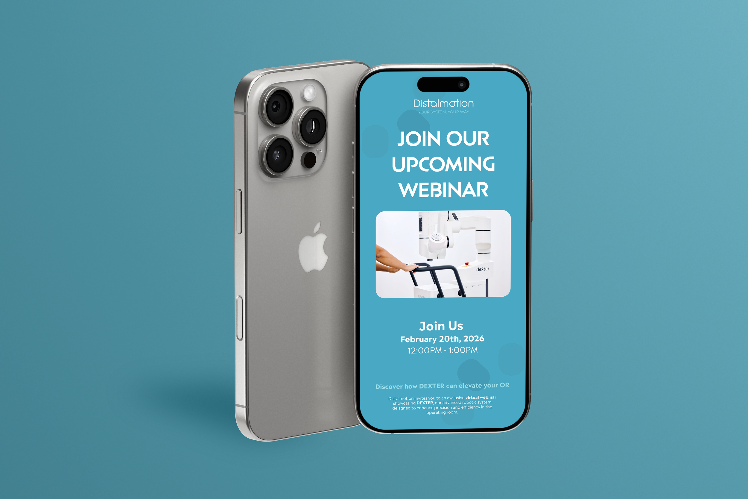
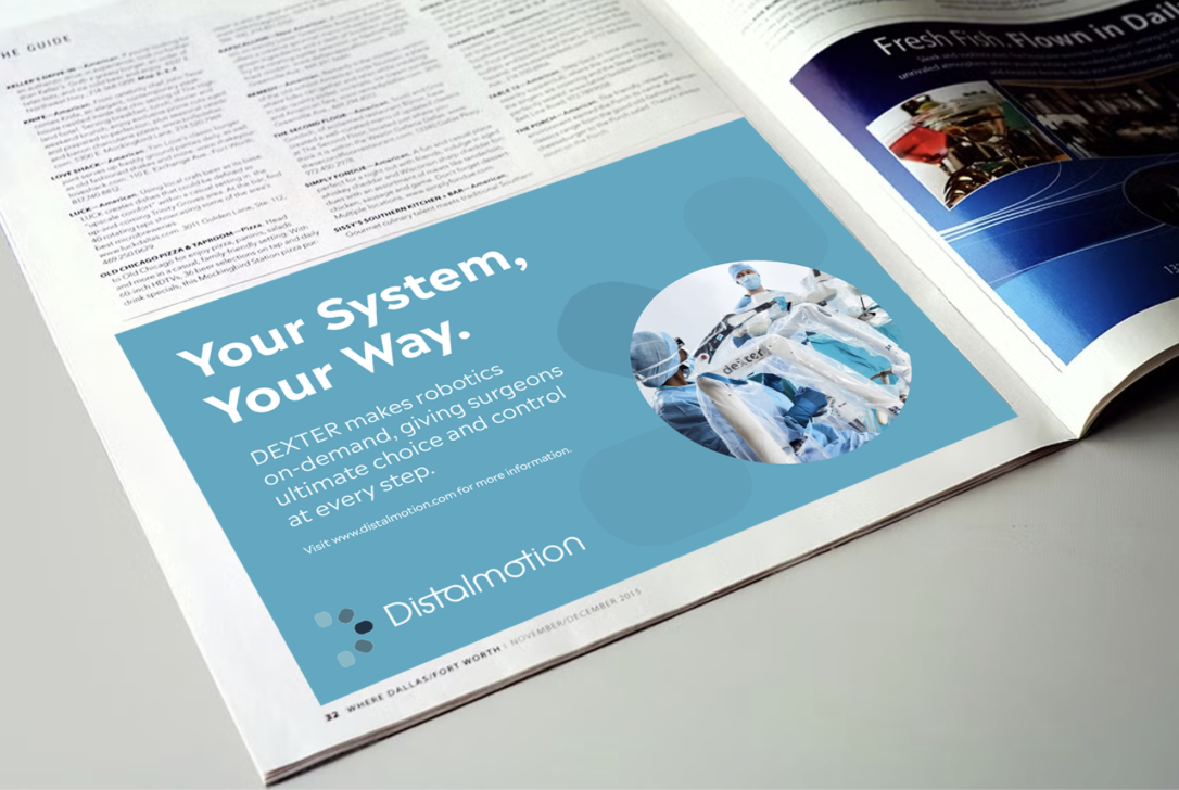
The design portion of our team worked alongside the marketing team to develop a strong and cohesive marketing plan for Distalmotion. For our tactical execution, we broke down how we would improve Distalmotion’s marketing moving forward. This included trade shows, field demos, webinars, email lists, brochures, and a content calendar for Instagram. I designed the email and a magazine advertisement in a similar format that was, again, cohesive with their current brand, but also progressive in pushing their marketing and visual branding forward.
Video and mockup of email on a phone. Image of magazine advertisement.
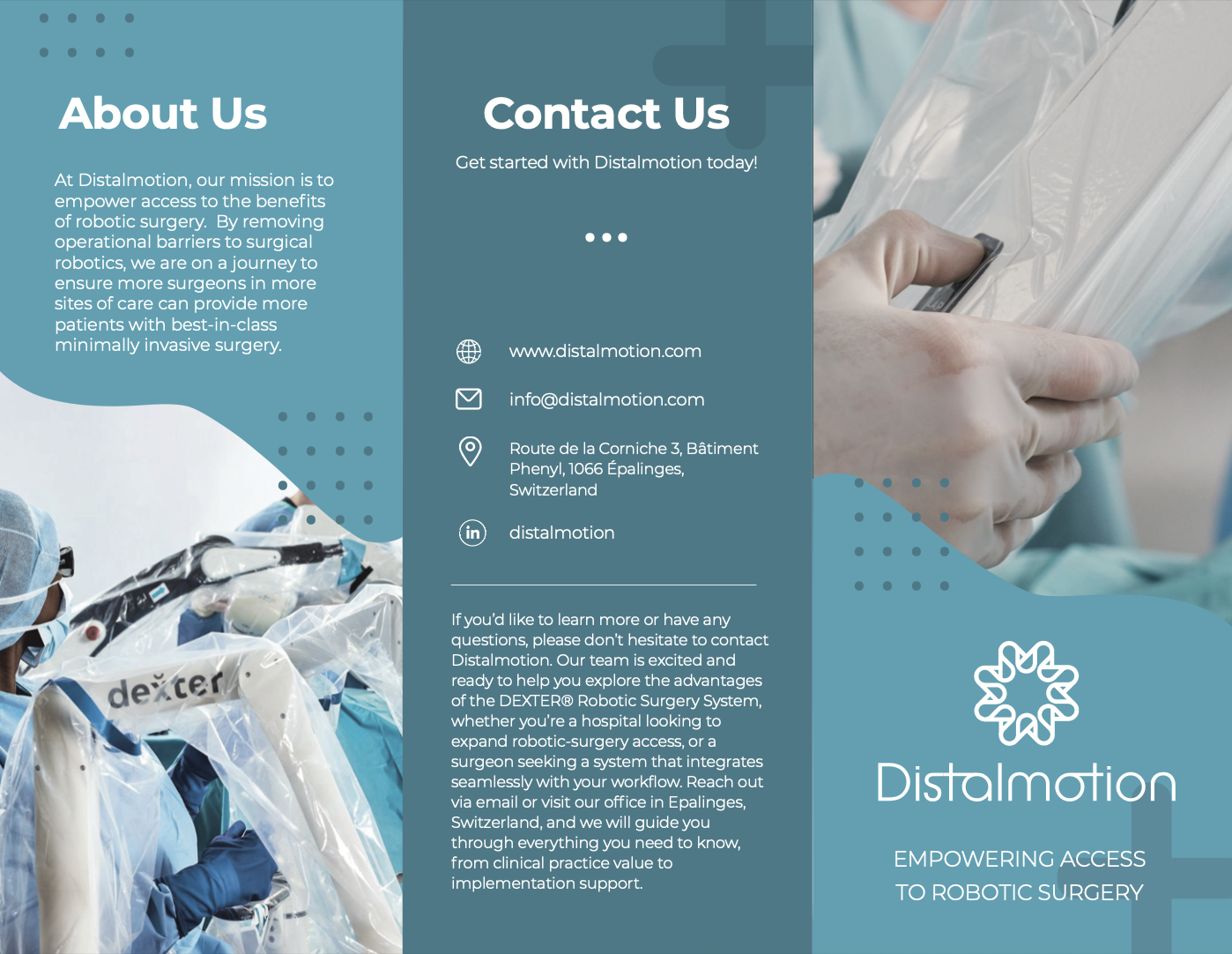
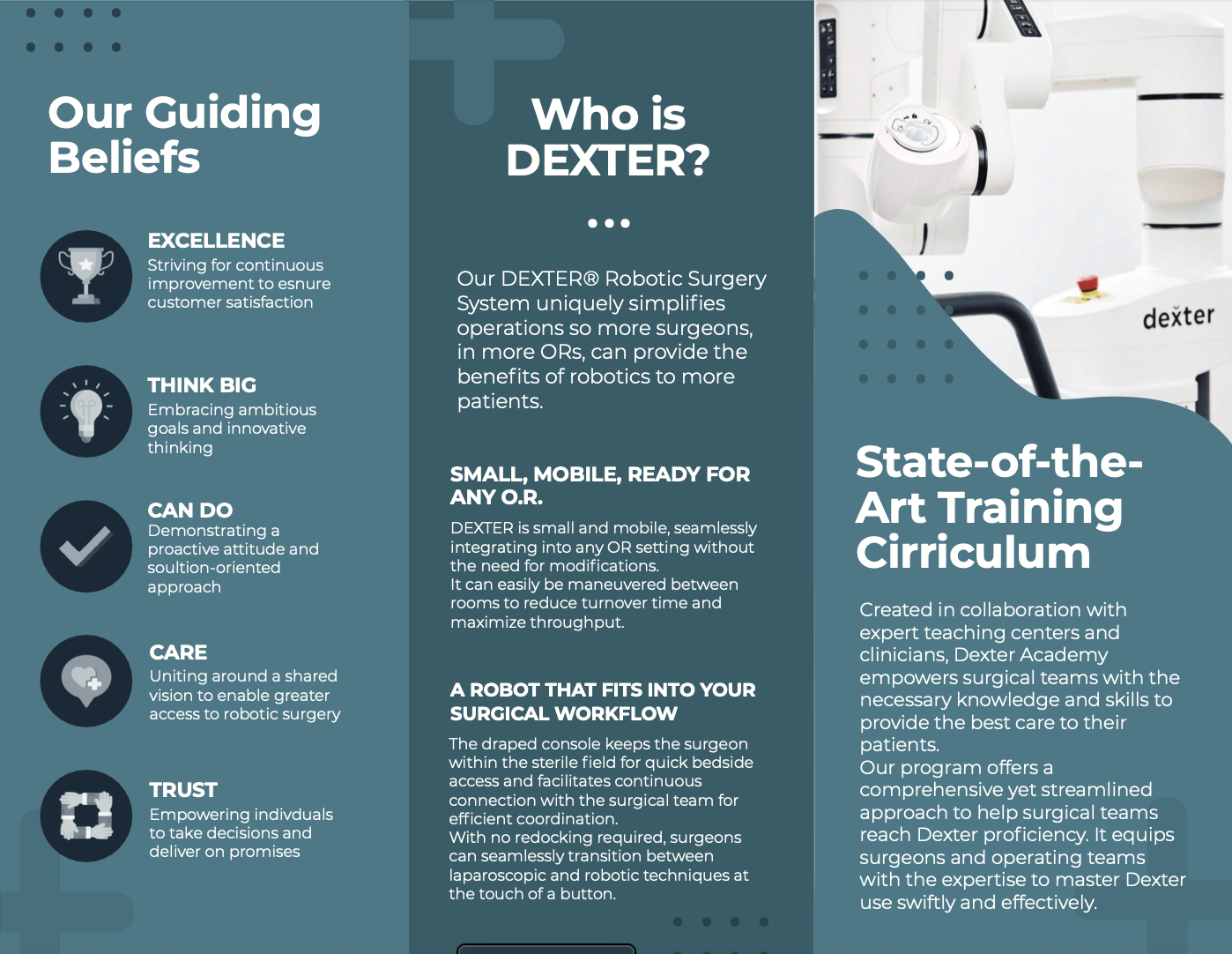
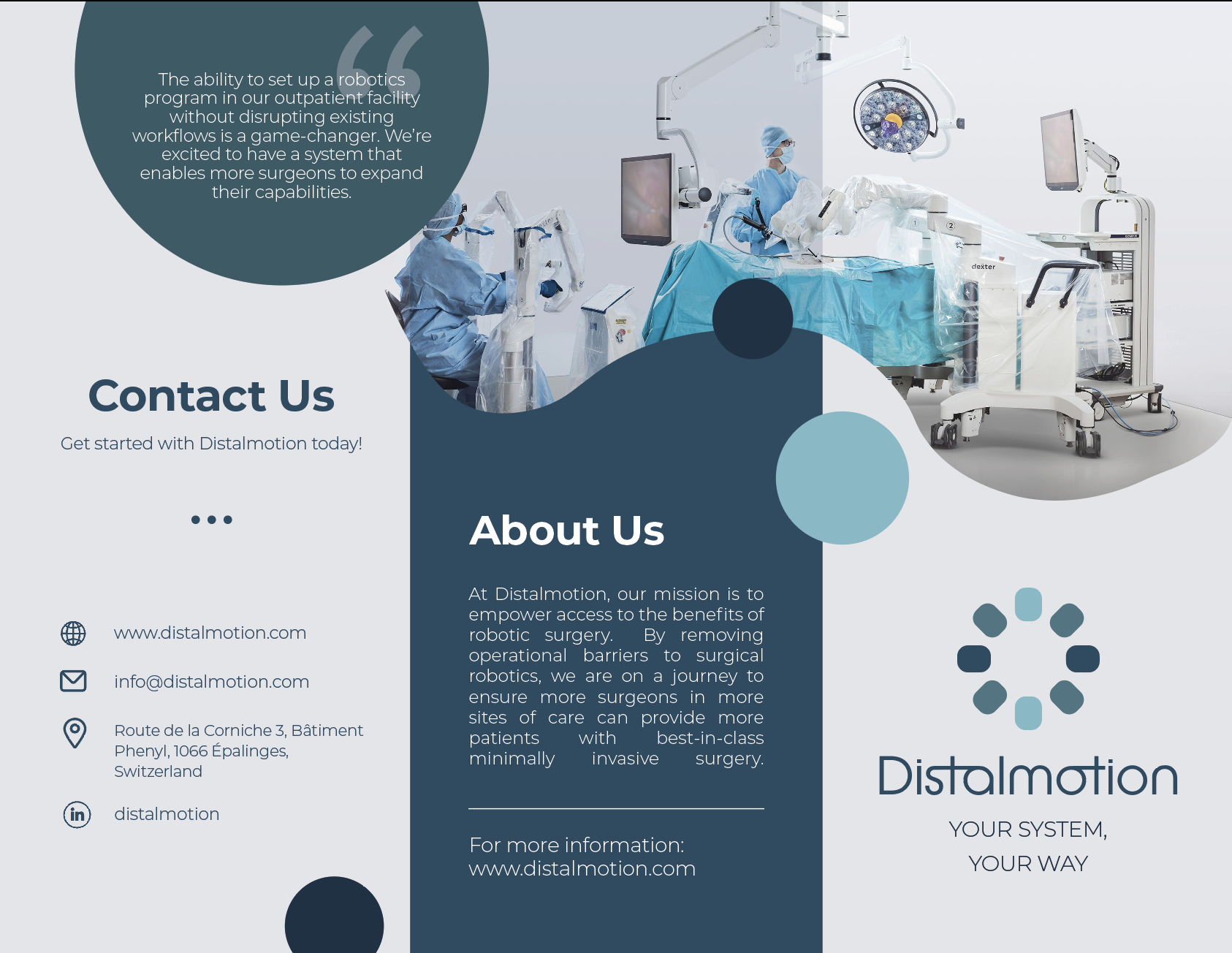
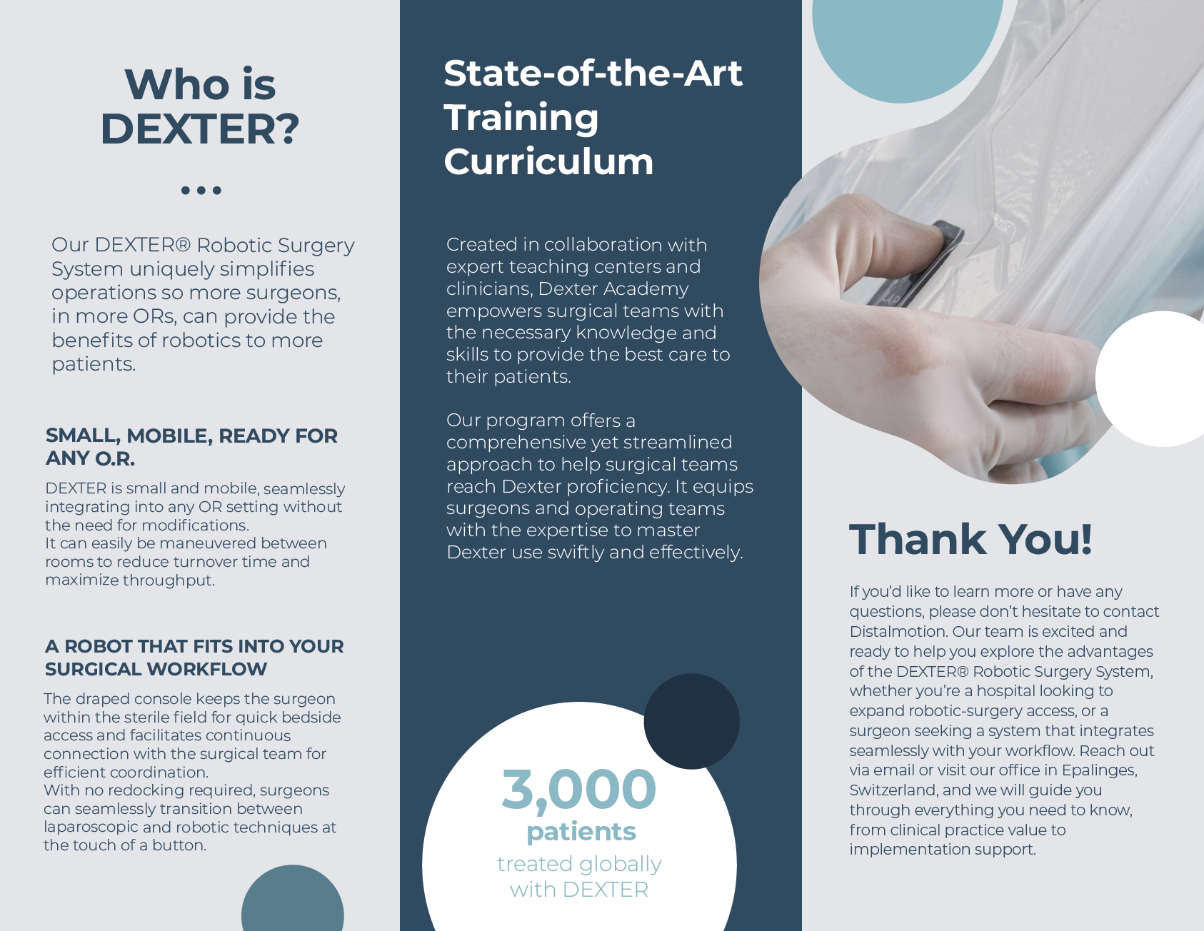
BROCHURE
The brochure was one of our marketing tactics to reaching new ASCs (Ambulatory Surgery Centers). We wanted to give people a “takeaway item” that would keep the brand Distalmotion in their mind. The first version of the brochure, in the cyan-teal tones, features information about Distalmotion as a company, their robot, training curriculum, and contact information. The second version, the gray and blue brochure, is similar. I swapped out the ‘Guiding Beliefs’ for a ‘Thank You' portion, showing the customers appreciation for their interest in Distalmotion’s company, products, and services. I also added some statistics and quotations from their website to create more visual interest and show the success of the company and their product, DEXTER.
Versions #1 and #2 of the brochures. Brochures were handed out physically during the final meeting.
other assets
Because our team wanted to go above and beyond to support Distalmotion’s possible expansion, we decided to compile other extra assets, such as a brand asset video, moving imagery of the logo’s design components, a brand board, and a process book for them to examine the process behind our logo.
Video promoting Distalmotion’s DEXTER, GIF of our logo components, breadboard, and logo process book flip through.